Math Animation Examples: Explore and Teach
Watch concrete mathematical explanations, identify what each animation teaches, and choose a pattern for your next lesson. Try a visual proof or a changing coordinate before planning your own animation.
Interactive lessons for specific mathematical ideas
Pythagorean theorem animation
Move four triangles between two arrangements. Compare the uncovered areas and explain why a² + b² = c².
Unit circle animation
Rotate a point, read sine and cosine, and trace the matching sine wave. Includes angle checkpoints and a teaching sequence.
A complete example with Python source
Follow the Manim beginner tutorial to build this scene. The downloadable source is for the slope example; the collection below provides visual references and teaching ideas.
Six visual patterns to learn from
Shade a probability interval
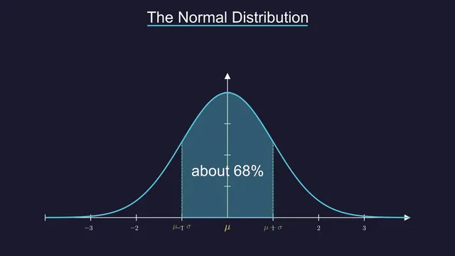
Reveal the curve first, then the interval. Explain that the shaded area represents probability, not the height of the curve.
Compare observed and expected counts
Keep categories aligned so the viewer can compare counts. A visible difference is not by itself evidence of statistical significance.
Introduce a probability formula
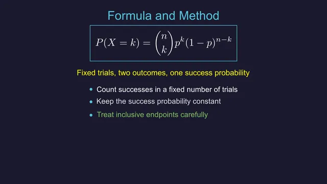
Explain n, k, and p before calculating. The model requires a fixed trial count, independent trials, and the same success probability.
Explain sample means
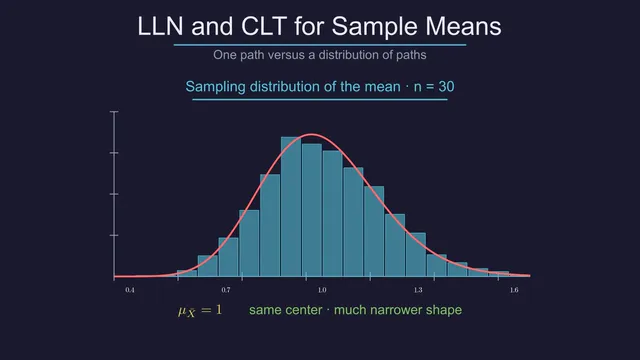
Distinguish individual observations from means of repeated samples. The usual central limit argument assumes independent, identically distributed observations with finite variance.
Show a two-factor study layout
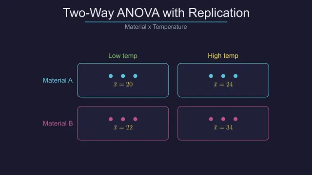
Use the grid to explain the design before a statistical result. This is different from the one-way worked example linked below.
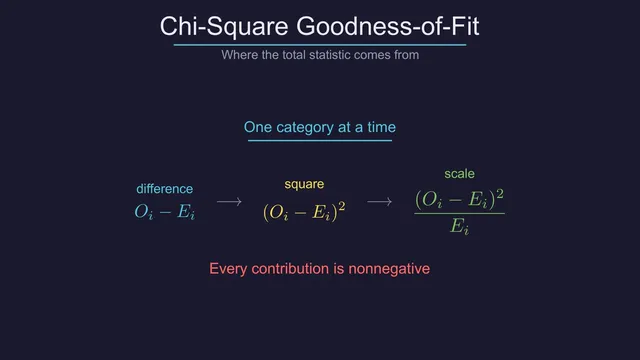
Connect counts to a test statistic
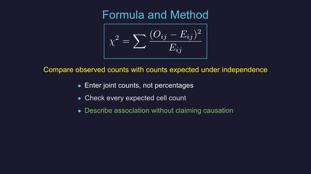
Explain the contribution of one category before adding all contributions. Include the appropriate degrees of freedom and assumptions in the full lesson.
Choose a lesson by what it explains
Use the Pythagorean theorem animation for an area proof, or the unit circle animation to connect rotation with sine and cosine. Each has its own controls, mathematical checks, and teaching sequence.
Choose an example by what should change
Use a graph when the explanation depends on a relationship between variables. Use aligned bars when the task is comparing categories. Use a formula reveal when the learner needs to understand a calculation in parts. Motion earns its place when it makes one of those relationships easier to follow.
The six short animations above reuse this site's existing mathematical scene assets. They are visual references, not six downloadable source-code projects or evidence of browser-based generation. The slope lesson includes both its Python file and its rendered MP4 so you can reproduce one complete scene.
Go from an illustration to a worked explanation
An animation alone does not establish a statistical conclusion. The chi-square test explainer works through observed and expected counts, while the ANOVA explainer separates between-group and within-group variation using a small teaching dataset. Their calculations and assumptions matter as much as the moving images.
For your own example, write down the input values and the conclusion the viewer should reach. Keep that conclusion narrow. A picture of group means can illustrate differences, but it cannot by itself show that a treatment caused those differences.
Make your own version
The Manim tutorial takes you through the complete slope scene and render command. The math animation workflow guide covers the earlier decisions: the teaching goal, input, storyboard, and checks. If you are still choosing an approach, compare math animation workflows and Manim alternatives.
Start by changing one parameter, predicting the mathematical result, and checking the output. Once that is correct, revise timing and narration. A visually polished scene still needs a clear and correct explanation.